Birchbox, the leader in beauty subscription services, was in need of a stronger and tighter identity system and a marketing platform surrounding the idea of the excitement of trying out new beauty products.
This post will address the branding approach.
The subscription beauty brand had recently gone through a rebrand where a unique logo-type and logo-mark was created. Instead of going through another branding overhaul, my solution was to strategically using the brand name and diamond shape locked up together. The result would be Birchbox owning the diamond shape (the box rotated 90 degrees), and be instantly recognized by this unique mark.
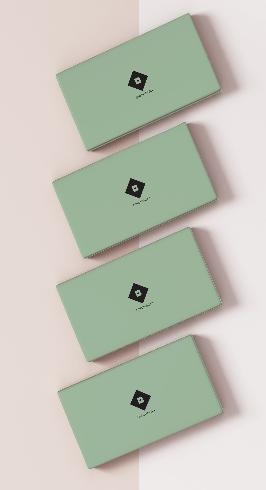
Color increases brand recognition by 80%. By choosing a unique color that is gender-fluid and symbolic of wellness and self-care, Birchbox can potentially increase their brand recognition.
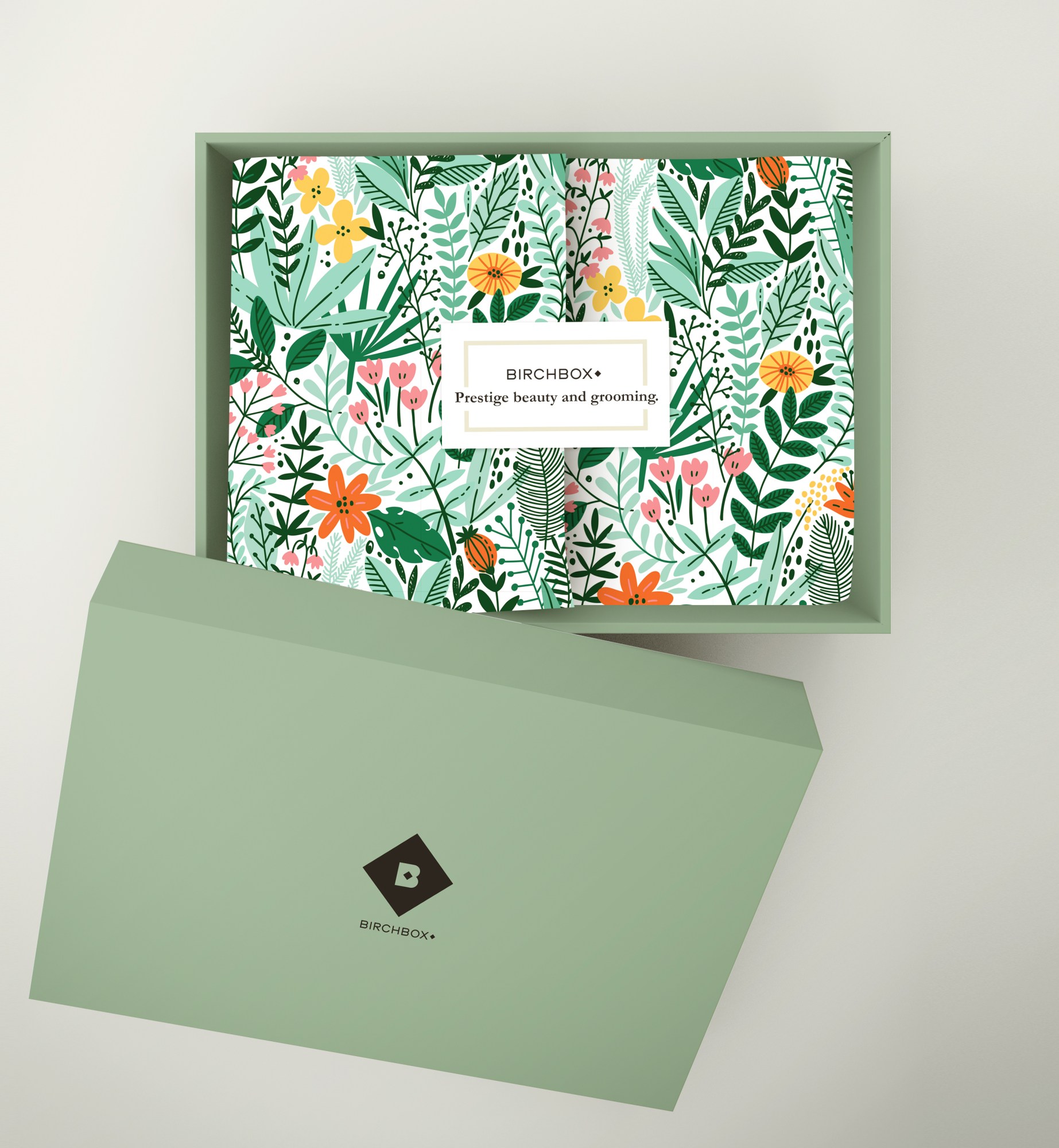
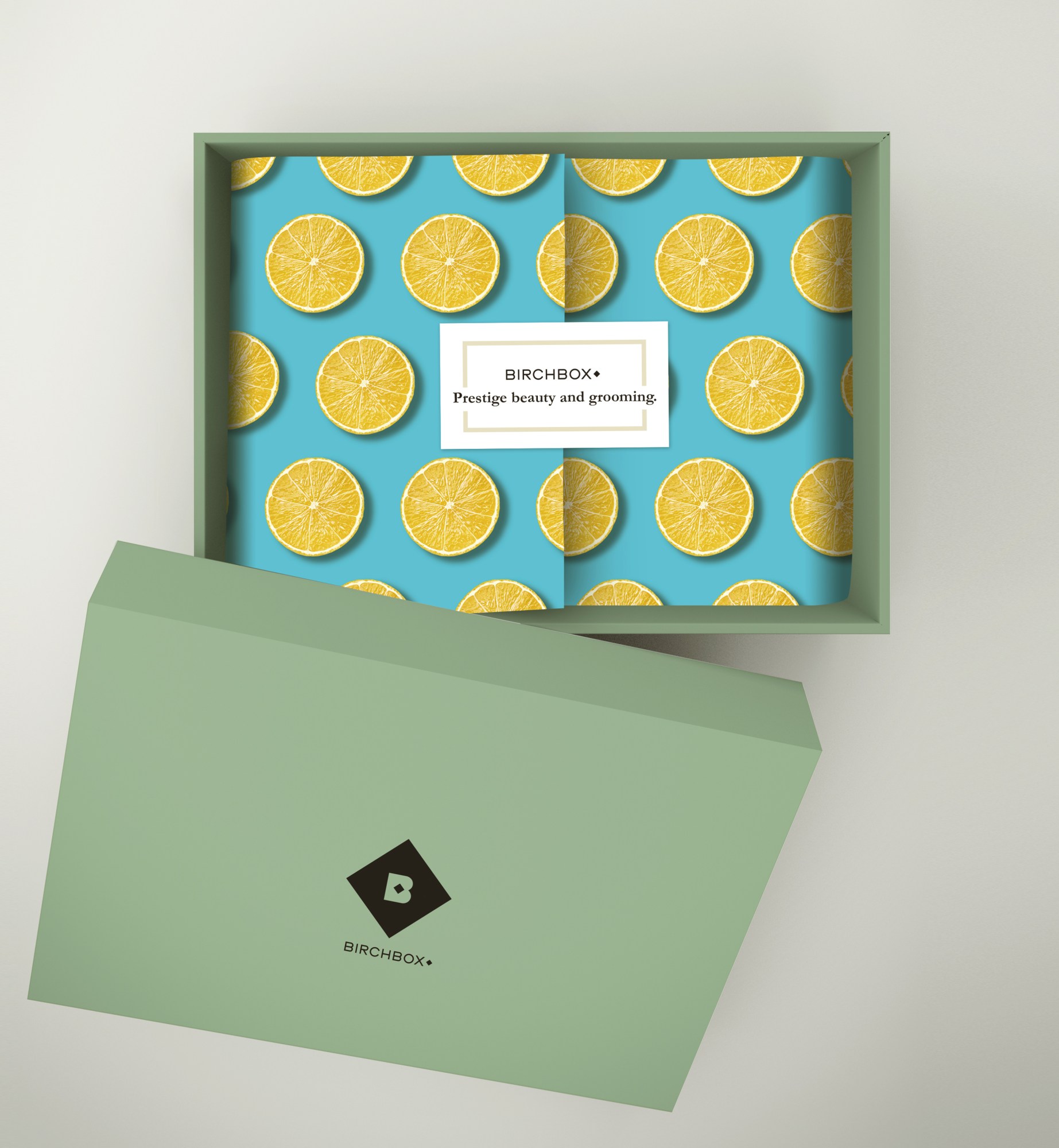
The exterior of the boxes were originally dressed in fun custom prints that were new every month. To maintain that element of customization and creativity, the prints were brought inside the green box and on the tissue paper that beholds the unique curation of products.
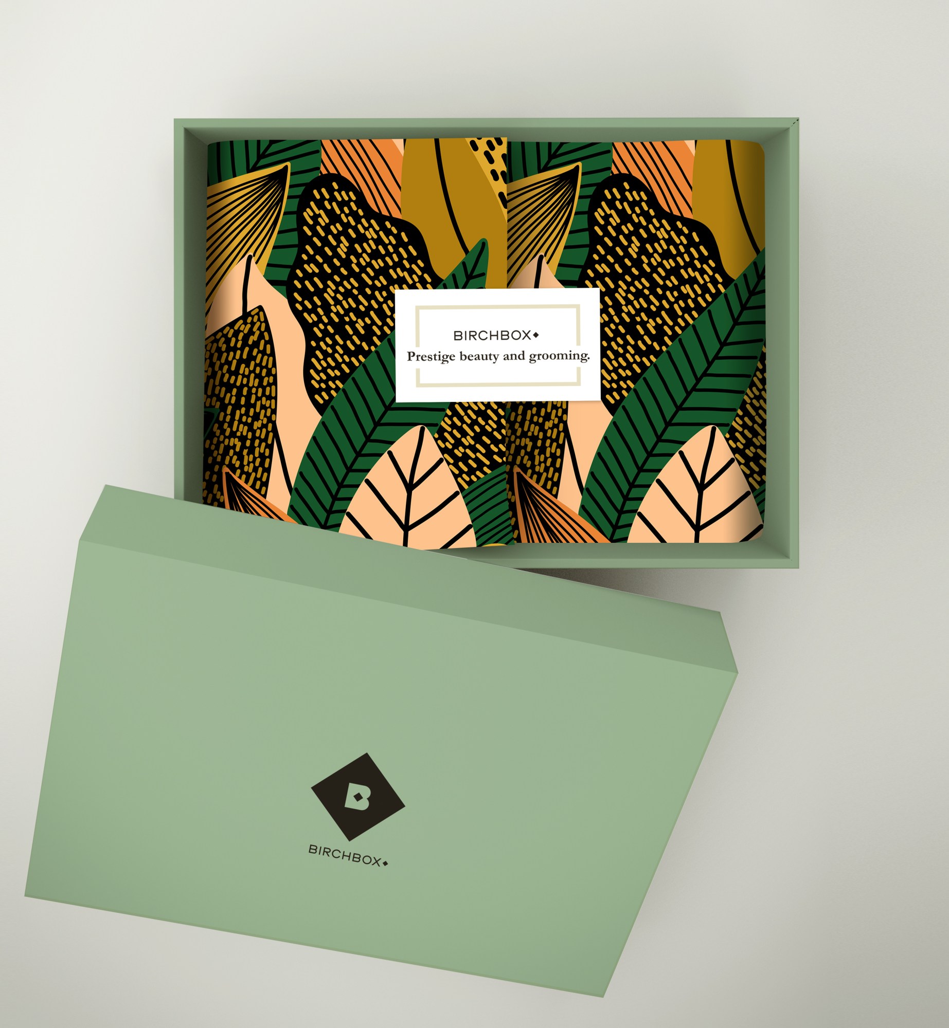
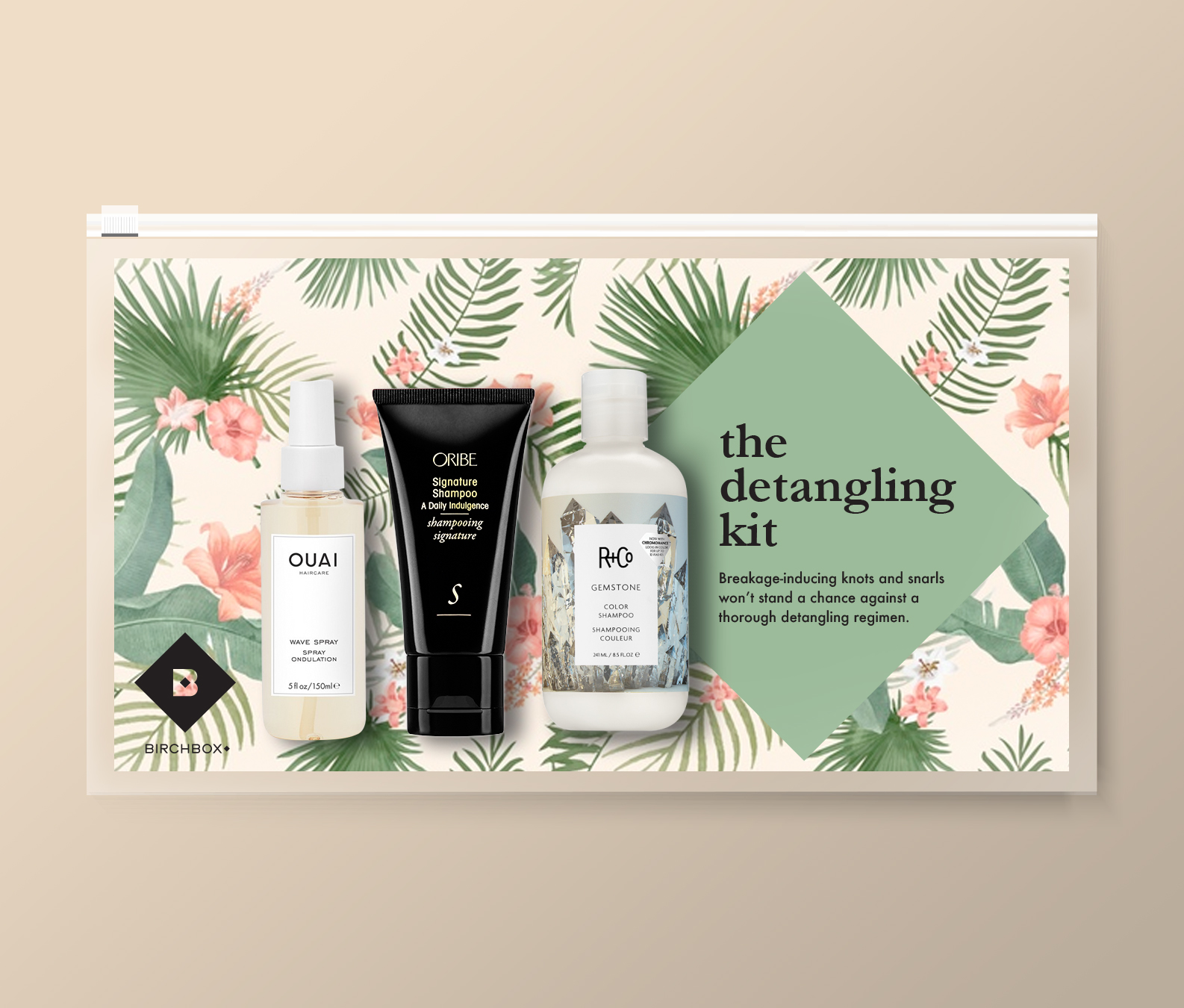
The diamond mark branding on the permanent kit collections.